Europe’s fuel mix and Britain’s carbon intensity on one desk — captured, measured through its relay, and set beside Electricity Maps and Energy-Charts itself.
Tested 2026-09-27Build 537, local copyDesktop capture 20:13:34ZPhone capture 20:13:40ZPublisher LABS, which also makes this tool
CH 02labs.llc/grid/captured 20:13:34Z
12345
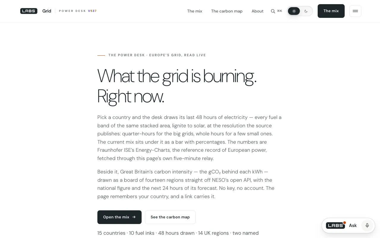
Callouts · desktop capture, 1280 × 800
1Callout 1: The eyebrow states the job: “The power desk · Europe’s grid, read live”.
2Callout 2: The lede promises “quarter-hours for the big grids, whole hours for a few small ones” — a claim our test checked.
3Callout 3: “Fetched through this page’s own five-minute relay”: the desk’s one server part, named on its first screen.
4Callout 4: Britain’s carbon intensity drawn as fourteen regions straight off NESO’s open API, with no key and no account.
5Callout 5: The inventory line: 15 countries, 10 fuel inks, 48 hours drawn, 14 UK regions.
Segment 1 · On screen
What it is, and who it is for
Grid is a power desk with two instruments. The first draws the last 48 hours of electricity generation, fuel by fuel, for any of 15 European countries, with the latest mix in percentages. The second shows Great Britain’s carbon intensity — grams of CO₂ per kilowatt-hour — as a national figure, a 24-hour forecast and fourteen regions on a tile board.
It is for anyone curious how their country’s power is being made right now, for energy writers and students, and for people in Britain choosing a cleaner hour to run a heavy load.
Segment 2 · Behind the picture
How it works
The two halves travel differently. Fraunhofer ISE’s Energy-Charts does not send the header a browser on another site needs, so Grid runs a relay, grid-proxy.php, on its own origin. The relay is deliberately narrow: one upstream route (public_power, the last 48 hours), a whitelist of fifteen countries, a window the server chooses, and a five-minute cache per country (lines 11–25, 49–56, 64–66). A crowd watching Germany costs Energy-Charts one call every five minutes, and the page refreshes on the same rhythm (app.js line 30). The British half needs no relay: your browser reads NESO’s API directly for the national figure, the forecast and the regions (lines 401–405).
On the way to the chart, the code declines to guess. It reads the time step off each series instead of assuming one (resLabel, line 182), trims quarter-hours nobody has reported into yet rather than drawing them as zero (line 217), and leaves out of the legend any fuel a country does not use. The regional British figures are labelled as the forecasts they are, on a drawn board rather than a survey map.
What it reads
api.energy-charts.info /public_power (Fraunhofer ISE), through grid/grid-proxy.php
api.carbonintensity.org.uk /intensity, /fw24h and /regional (NESO), read by your browser
Segment 3 · The test
What we measured, and when
At 20:14:02 UTC we asked the relay for Germany. It answered in 0.0015 seconds — from its cache — with 27,202 bytes: 186 points at 15-minute steps and 21 series, from lignite and hard coal to offshore wind, solar, load and the renewable share. Switzerland, asked in the same second, came fresh from upstream in 0.44 seconds: 44 hourly points and 12 series, nuclear and run-of-river hydro among them. So callout 2 holds up — one country quarter-hourly, the other hourly, each labelled as it is.
We then asked for Great Britain, which is not on the relay’s list. It refused with HTTP 400 before fetching anything: this is not an open proxy. At 20:14:07 UTC the British regional feed returned 18 entries for the 19:30–20:00 window: Great Britain at 84 g/kWh (“low”), North Scotland at 0 and South Wales at 331 (“very high”).
390 × 84420:13:40Z
12
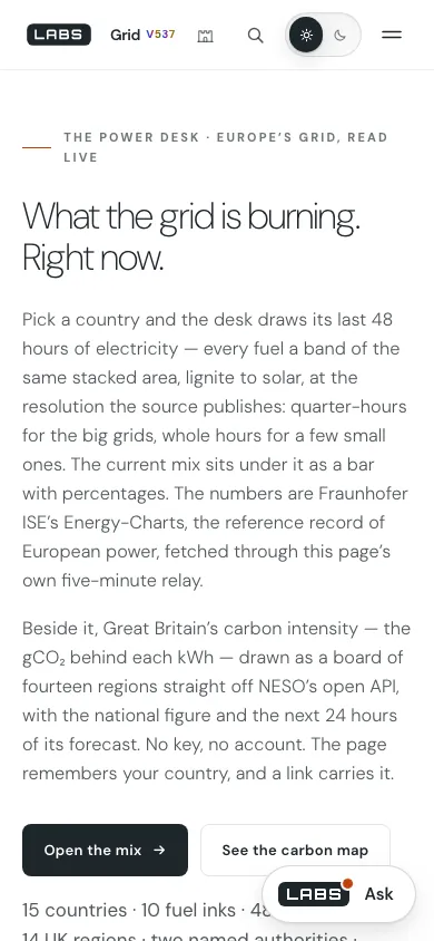
Callouts · phone capture, 390 × 844
1Callout 1: At 390 pixels the lede sets cleanly, with the relay named in the first paragraph.
2Callout 2: In this first-screen capture the floating Ask launcher sits over the inventory line. We did not test whether it moves aside on scroll.
Segment 4 · Other channels
Beside Electricity Maps and Energy-Charts
Each comparator was checked on the date shown. We say what each does better before we say where Grid goes further.
A free live map of carbon intensity and electricity production by zone, worldwide, with a paid API and datasets.
What it does better
Zones on every continent, carbon intensity for each of them, and history and forecasts beside the live signal.
Where Grid goes further
Grid names the single upstream it reads and prints each series’ own time step and read time on the page (app.js lines 167–172), and draws Britain’s regional forecast as a fourteen-tile board in the API’s own bands.
Checked 2026-09-27 20:18 UTC · the site returned only its title to our fetch; verified from Fraunhofer ISE’s press release on its tenth year
What it is
The source itself: generation, trade, emissions, exchange prices and capacity for 42 European countries, with an open API.
What it does better
Far deeper — 42 countries, years of history, prices and emissions — and it is the primary record Grid reads.
Where Grid goes further
Grid sets the continental mix beside Britain’s carbon intensity from two different public sources on one page, and holds its own load on the source to one call per country per five minutes.
Segment 5 · Dropouts
Where it falls short
Fifteen countries, while Energy-Charts covers 42.
Forty-eight hours only: the relay fixes the window and a visitor cannot lengthen it.
Carbon intensity for Great Britain alone; the continental countries get a fuel mix but no g/kWh figure.
No prices, cross-border flows or generation forecasts, all of which Energy-Charts publishes.
Segment 6 · End card
The verdict
Grid is a small, exact window on two large datasets. It shows less than either source, but every number it does show carries its own step, its own read time and its own origin. Watch it for the shape of today; go to Energy-Charts for the long view.